
My First Time with Risograph Printing: Salvaged Paper Notebooks
Originally published at alabapsi.com on January 28, 2026.
Hey folks, this is Britney (aka Bapsi). I made these risograph notebooks as Christmas gifts this year, and the whole project happened because of CRASH Space. From Lindsey’s patient troubleshooting to Lavie fixing the paper cutter I broke, this was a crash course in learning a new tool with community support. If you’re curious about the risograph or just want to see what goes into making something by hand, here’s how it went.
When I decided to make larger field notes-style notebooks as Christmas gifts this year, I knew I wanted to try something new. The risograph printer at CRASH Space had been calling my name, and this felt like the perfect excuse to finally learn it. The plan was simple enough: create a limited palette pattern for the covers, use salvaged paper from my stash for the interior pages, and bind them somehow. What followed was a crash course in community-supported printmaking, complete with creative frustration, technical mishaps, and about 20 notebooks that actually turned out pretty well.
Designing the Pattern
Before I could print anything, I needed a design. I pulled together a mood board in Freeform, collecting Japanese textile patterns I’d scanned years ago at Art Center and reference photos from CRASH Space showing how risograph layers interact. The graphic quality of those traditional patterns spoke to me. Some barely looked like they tiled at all, more like interesting textures than formal repeats.
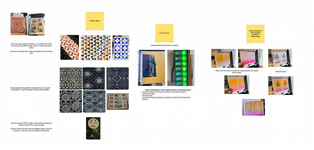
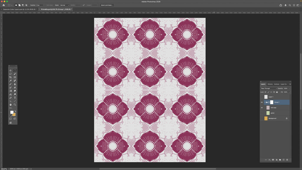
I started with analog tessellation experiments, cutting paper guides and sketching from them. It was fun to reconnect with that hands-on approach, but the format slowed me down too much. I abandoned that pretty quickly and moved into Photoshop, using the pattern preview feature to iterate faster.
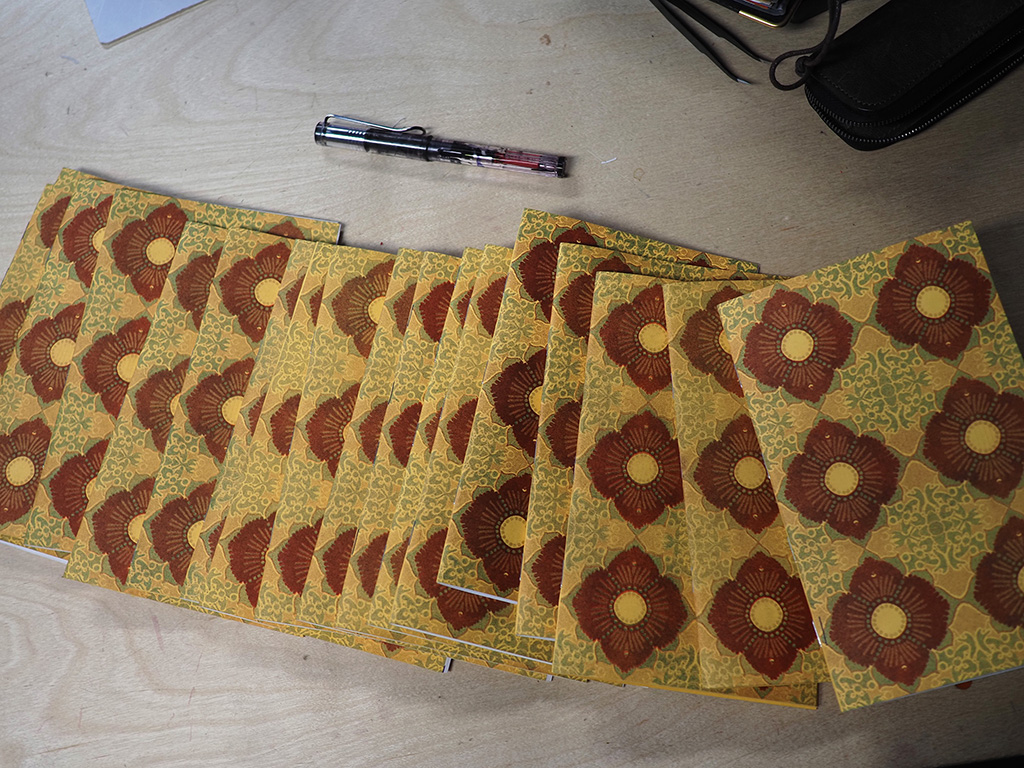
What followed was a mini design gauntlet. I worked through seven different attempts, exploring everything from traced reference pieces and dual symmetry patterns to seasonal themes like snowmen and peppermint candies. Some directions felt forced, others just plain fell flat. A few got derailed by distracting textures or brushes that weren’t quite right for the look I wanted. The breakthrough came when I asked myself: how can I make this easier? What would be more fun to do? I didn’t have to turn everything into a huge effort for it to be worthwhile. The final version made use of multiple layers with varying opacity, playing with how the colors interacted. It was good enough to move forward, and more importantly, the rest of the project (the actual building and learning the printing) was what mattered most.
File Prep and Technical Setup
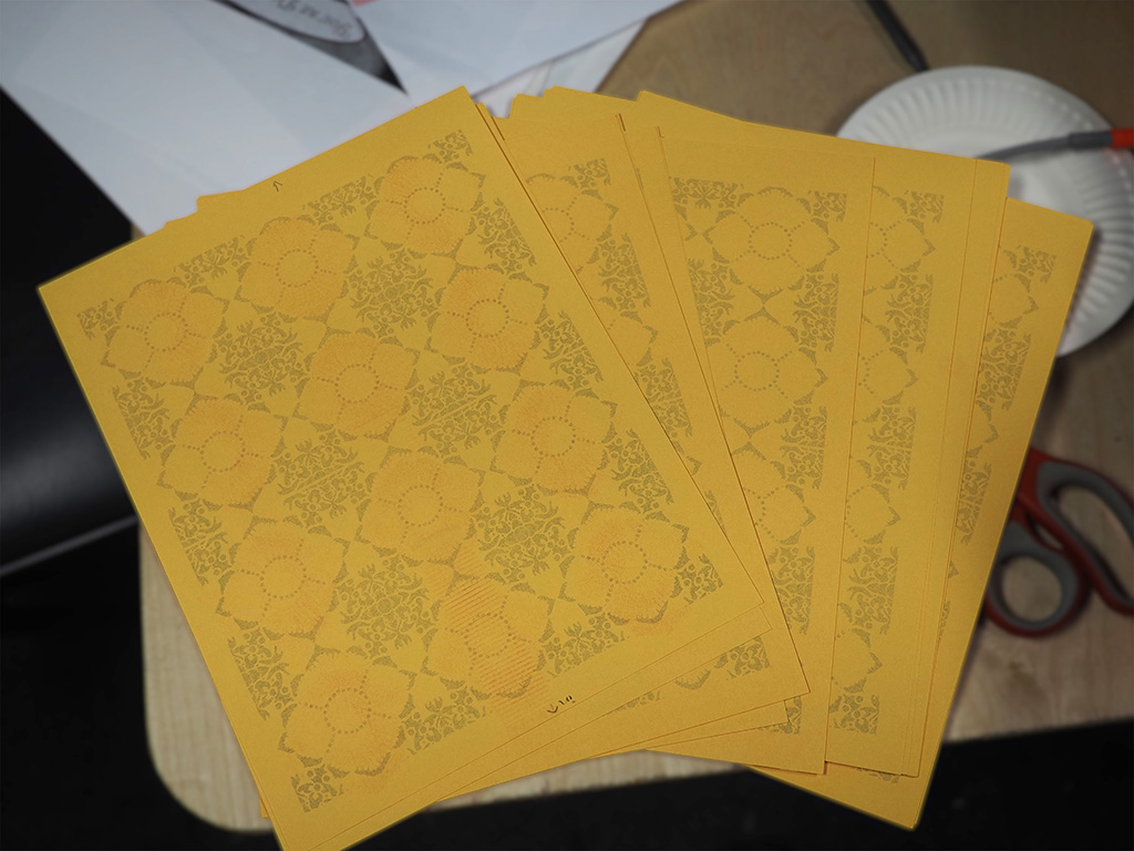
With a design settled, I moved into Affinity Layout to prepare the print files. I tiled the pattern and exported it, working with assumptions about how it would repeat. My main concern: would the risograph handle the detail at this scale, or would I need to make everything bigger? I exported as PNG based on what I thought the file requirements would be.
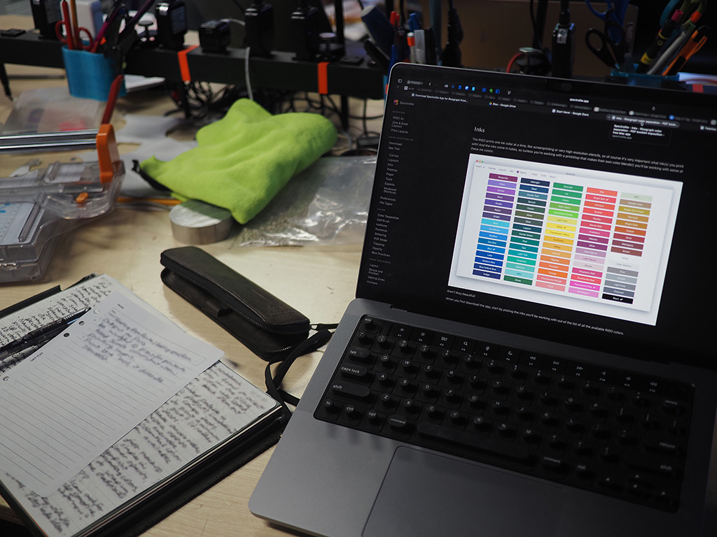
When I got to CRASH Space and started working with Spectrolite (the risograph preview software), the process turned out to be much more straightforward than expected. One of the members had assembled documentation, manuals, and support files like ink color swatches to make onboarding easier for beginners. I approximated the yellow scrap paper color by eye and set up my layers in the preview.
Learning the Risograph: Printing Day
Lindsey, one of the folks at CrashSpace, gave me the essential advice:
- Output as PNG (got that right)
- Keep scale consistent when printing layers
- Print blue last because it dries the slowest
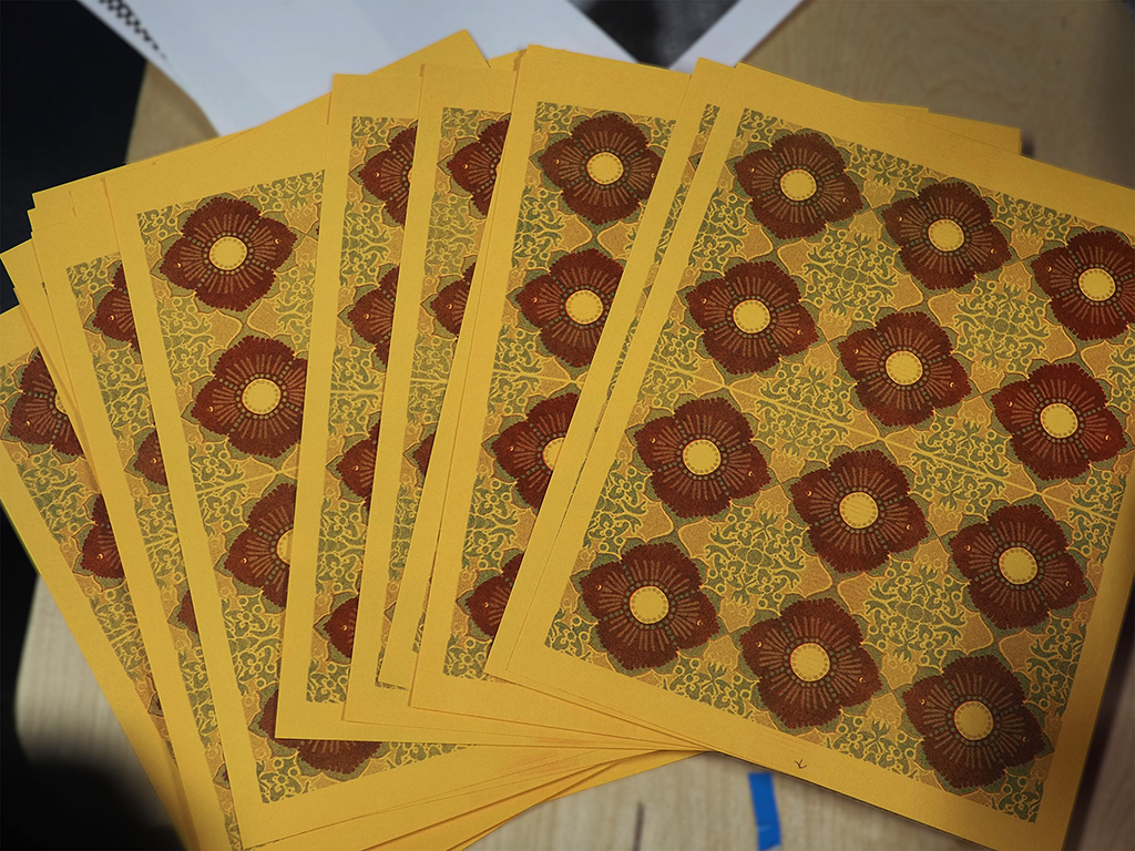
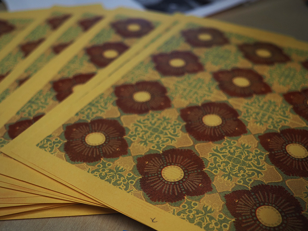
I cut a master and printed my first test using scarlet red, the lightest color in the palette. Somehow two prints came out instead of one. Then I made my first real mistake: I cut a brand new master for the blue layer right after that scaled test print. That master was essentially wasted since I’d only printed one copy. Lindsey explained the ideal process: after verifying your test print looks good, print the remainder from the machine itself, not from the computer again. But I’d already cut the master for blue and loaded the blue drum, so I made the call to print blue first instead of last. Not ideal for drying time, but sometimes you work with the situation you’ve created.
The actual printing went smoother than expected. The community documentation made all the difference. People in the space had taken time to document their processes, and that’s directly valuable to someone like me learning for the first time.
Assembly and Refinement
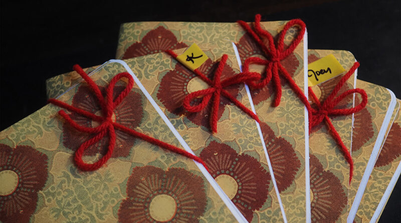
Once the prints were dry enough, assembly began. I pulled out paper from my personal stash, including pages from some sketchbooks I’d started when I was about 11 and never finished. Those pages had been sitting in my studio closet for years, waiting for exactly this kind of shot at a second life. Some of the notebooks got dot-grid pages I’d printed earlier, others got the plain salvaged paper.
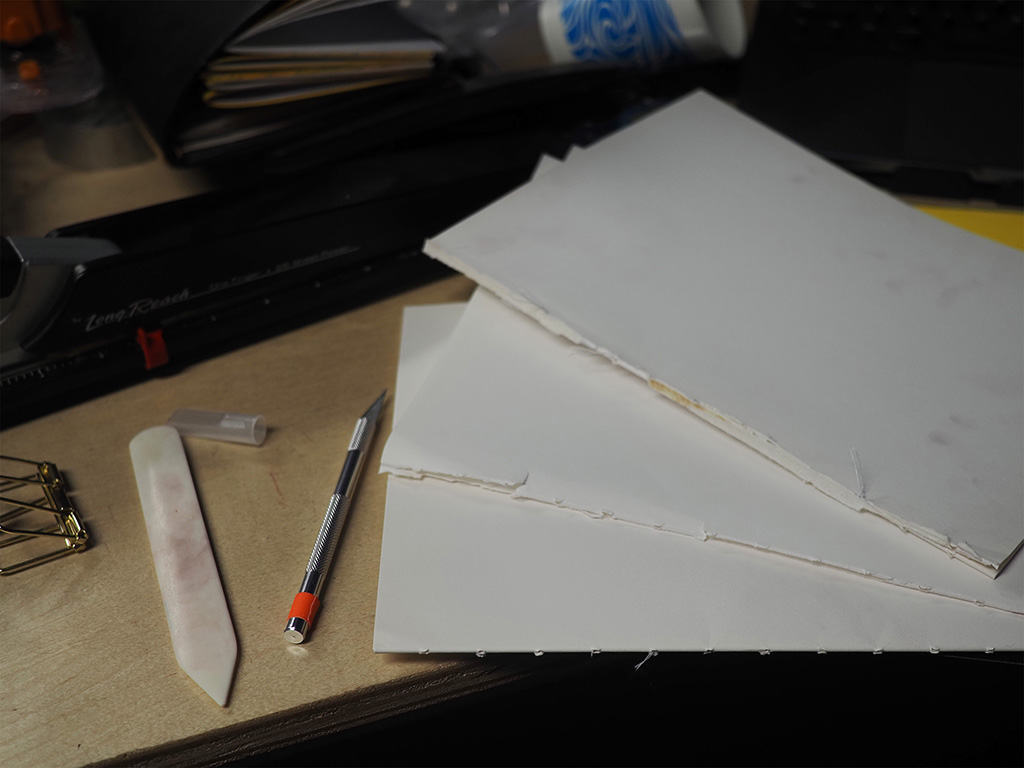
Unfortunately, while trimming these sheets to size, I broke the paper cutter blade! I was trying to cut too many pages at once, and the blade got moved from the track. The plastic guide piece sliced. Thankfully, Lavie, another member of CRASH Space, was present the same day and took the time to disassemble the cutter and fix it. With the self-sharpening blade back in working order, I trimmed more carefully, taking fewer pages at a time.
The good news: CRASH Space has a long-reach stapler. I didn’t have one at home and had worried I’d need to stitch-bind everything (which would have been tedious and hard on my wrists). The stapler was old and wobbly, but got the job done okay.
The corner cutting came later. I multitasked during an Analog Tools meetup, working through each notebook with my corner punch. I also did additional trimming to correct any misalignment from the stapling process. Everything came out much neater.
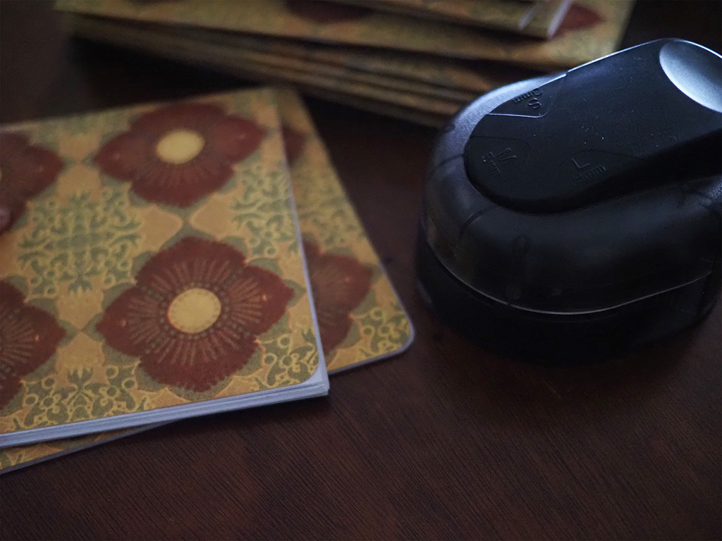
Final touches included erasing fingerprints and smears (keeping the handmade character while removing what felt like too much roughness), and numbering the prints. For some, I wrote meaningful little messages about the salvaged paper’s origins.
What I Learned
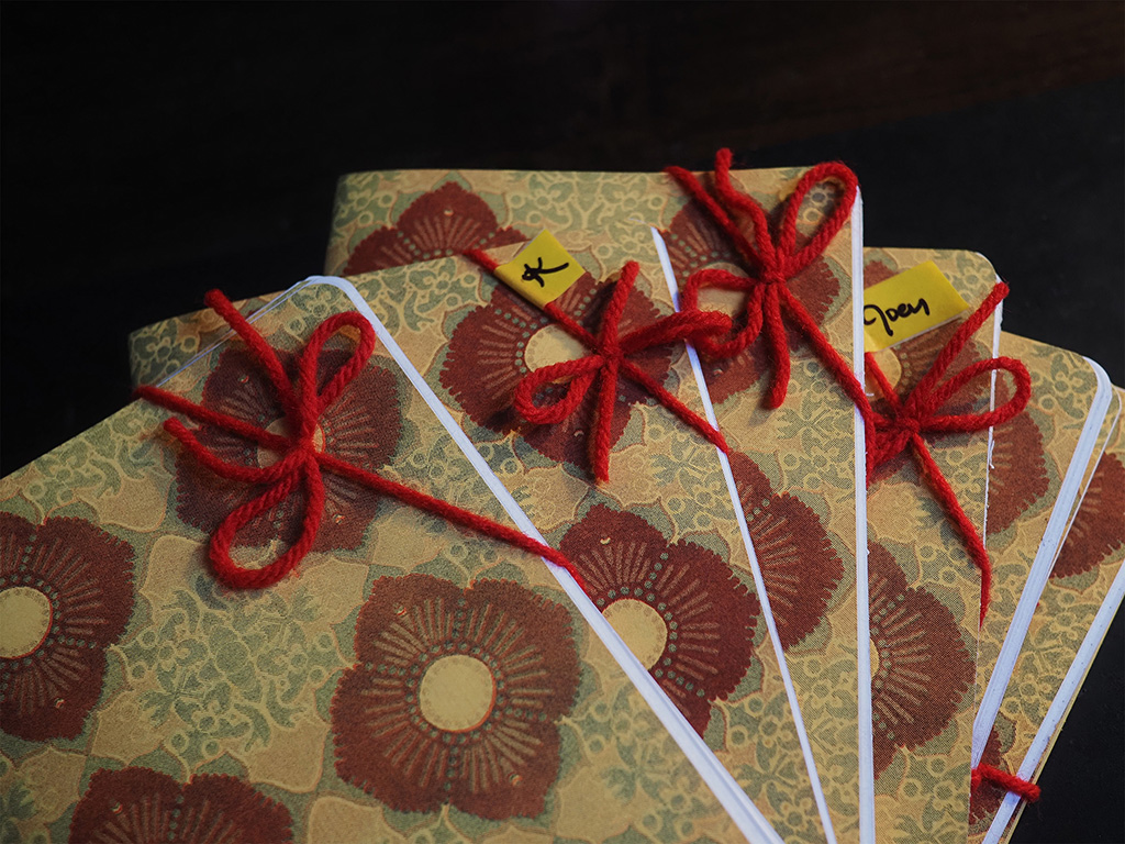
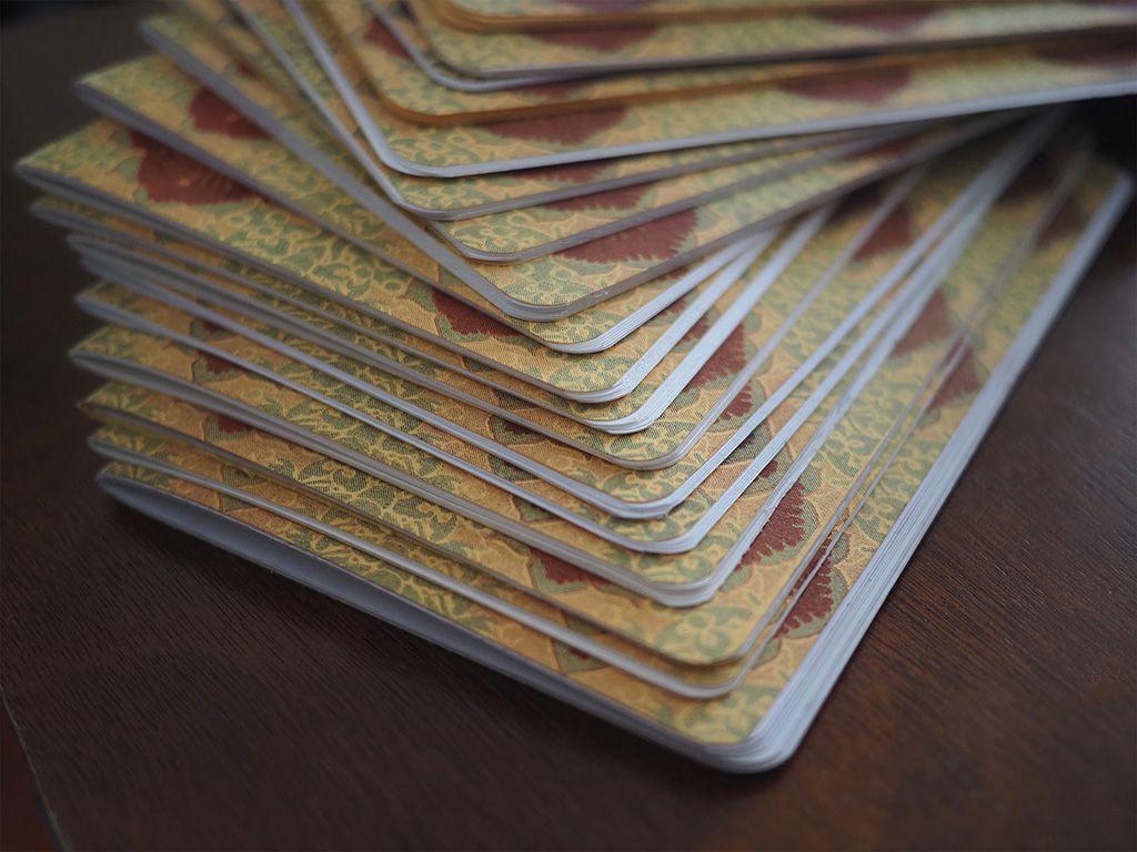
I ended up with approximately 20 notebooks. The risograph handled the pattern detail better than I’d worried it would. The colors layered nicely on the yellow scrap paper, though the paper wasn’t quite absorbent enough to prevent all smearing. I gave the first completed notebook to Lindsey as a show of gratitude for their help. They gave me their first notebook attempt too, from some time before. A bit of an exchange between makers.
What worked: The software was simpler than expected. Community resources and documentation made learning approachable. Letting go of design perfectionism to focus on completion was the right call.
What could improve: The staples could be neater. The yellow paper’s absorbency wasn’t ideal for the risograph ink.
The broader lesson: I experienced the typical creative process arc. Frustration, experimentation, eventual breakthrough. I haven’t worked on something this hands-on in a long time. Taking a step back to ask what would be easier and more fun made all the difference. The notebooks aren’t perfect, but they’re done, they’re handmade, and they turned out well enough that I’m genuinely happy to give them as gifts.